What is Checkbutton Widget?
The Checkbutton widget is used to implement on / off selections. A Checkbutton can contain Text, Image and similar to normal buttons we can associate Python function to this widget which gets called whenever the user pressed the button.
Example
The following Python script creates a window that contains one Checkbutton with a text “Turn On”. One method is associated with this check button so whenever you clicked on it, It calls the functions and inside the function, we can implement our own logic.
You need to write following code in any text editor and then save it with .py extension. To execute the application, Type python CheckButtonExample.py command in terminal.
from tkinter import *

# Top level window
window = Tk()

window.title("Studyfied.com")
window.geometry('350x200')

toggleState = IntVar()

# Python function associated with 'checkbutton'
def toggle():
    print("Toggle", toggleState.get())

# A CheckButton
checkbutton = Checkbutton(window, text="Turn On", command=toggle, variable=toggleState)
checkbutton.pack()

window.mainloop()
Output
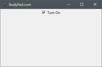
The above code produces the following output in windows operating system.
Explanation
Following line creates a Tkinter window
from tkinter import *

window = Tk()

window.title("Studyfied.com")
window.geometry('350x200')
See explanation of Tkinter window – Tkinter top level window
It is a python function which is associated with our check button. Whenever function gets called it prints the current state of check button 1 or 0.
# Python function associated with 'checkbutton'
def toggle():
    print("Toggle", toggleState.get())
This snippet creates a check button widget, the first parameter is the name of the parent window. Here it is “window”. The second parameter is text which is used to set some text to be displayed on Check button, the third parameter is used to set action command for this button which is ‘toggle’, toggle() is defined just above of this line, and the last parameter is Tk integer variable to monitor the current state of Check button.
# A CheckButton
checkbutton = Checkbutton(window, text="Turn On", command=toggle, variable=toggleState)
checkbutton.pack()
The second line checkbutton.pack(), is geometry manager that packs widgets into rows or columns.
Some checkbutton properties
| Property Name | Description |
|---|---|
| anchor | Controls the position of the text (or image) within the button. Valid values: N, NE, E, SE, S, SW, W, NW, or CENTER. Default is CENTER. |
| background / bg | Sets the background color of widget, Default Is platform specific |
| bitmap | Bitmap to be displayed on the widget. If the image option is specified, this option is ignored silently. |
| borderwidth / bd | Width of buttons border. The default is system specific but usually 1 to 2 pixels. |
| command | The function or method called when the button is pressed. A callback is a function, a bound method, or any other callable Python object. If you do not use this option, nothing happens when the user presses the button. |
| compound | Controls how text and images within a button are combined. By default, if an image or bitmap is given it will be drawn instead of text. When this option is set to CENTER, text is drawn on the image. Valid values: BOTTOM, LEFT, RIGHT, or TOP |
| cursor | The cursor to display when the mouse moves over the button. By default, the standard cursor is used. |
| disabledforeground | The foreground color to use when the button is disabled or invalid. The default is system specific. |
| font | Font to use for button. Buttons can only contain single font text. The default is system specific. |
| foreground / fg | The color of the button used for text color and bitmap for button. The default is system specific |
| height | The height of the button. If text is displayed on the button, the size is indicated in text units. If an image is displayed on the button, the size is specified in pixels (or screen units). If you set the size to 0 or omit it, it is calculated based on the contents of the label. |
| image | Image to display on the widget. The value must be PhotoImage, BitmapImage, or compatible object. If specified, this overrides text and bitmap options. |
| padx | Horizontal padding to add around the text. The default is 1 pixel. |
| pady | Vertical padding to add around the text. The default is 1 pixel. |
| offvalue | Sets the value for checkbutton when it is not checked. |
| onvalue | Sets the value for checkbutton when it is checked. |