What is Label Widget?
The label is the Tkinter widget class and it is used to display text and images. Labels are widgets that the user does not manipulate/interact with it. It is only used to display some information or values.
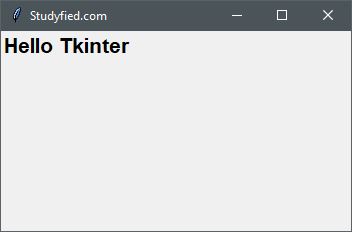
Example
The following Python script creates a window containing one label widget with text “Hello Tkinter”.
You need to write following code in any text editor and then save it with .py extension. To execute the application type py LabelExample.py command in terminal.
from tkinter import *

window = Tk()

window.title("Studyfied.com")
window.geometry('350x200')

label = Label(window, text="Hello Tkinter", font=("Arial Bold", 16))
label.grid(column=0, row=0)

window.mainloop()
Output
The above code produces the following output in windows operating system.
Explanation
Following line creates a Tkinter window
from tkinter import *

window = Tk()

window.title("Studyfied.com")
window.geometry('350x200')
See explanation of Tkinter window – Tkinter top level window
The following block of code creates a label widget.
label = Label(window, text="Hello Tkinter", font=("Arial Bold", 16))
label.grid(column=0, row=0)
Properties
- window – The container window.
- text – Text to be displayed on the label widget.
- font – Font family and size for text on the label.
Grid method sets the position of the label on parent form/widget.
Some label properties
| Property Name | Description |
|---|---|
| anchor | Controls the position of the text (or image) within the label. Valid values: N, NE, E, SE, S, SW, W, NW, or CENTER. Default is CENTER. |
| background / bg | Sets the background color of widget, Default Is platform specific |
| bitmap | Bitmap to be displayed on the widget. If the image option is specified, this option is ignored silently. |
| borderwidth / bd | Width of label border. The default is system specific but usually 1 to 2 pixels. |
| compound | Controls how text and images within a label are combined. By default, if an image or bitmap is given it will be drawn instead of text. When this option is set to CENTER, text is drawn on the image. Valid values: BOTTOM, LEFT, RIGHT, or TOP |
| cursor | The cursor to display when the mouse moves over the label. By default, the standard cursor is used. |
| disabledforeground | The foreground color to use when the label is disabled or invalid. The default is system specific. |
| font | Font to use for labels. Labels can only contain single font text. The default is system specific. |
| foreground / fg | The color of the label used for text color and bitmap label. The default is system specific |
| height | The height of the label. If text is displayed on the label, the size is indicated in text units. If an image is displayed on the label, the size is specified in pixels (or screen units). If you set the size to 0 or omit it, it is calculated based on the contents of the label. |
| image | Image to display on the widget. The value must be PhotoImage, BitmapImage, or compatible object. If specified, this overrides text and bitmap options. |
| padx | Horizontal padding to add around the text. The default is 1 pixel. |
| pady | Vertical padding to add around the text. The default is 1 pixel. |