What is LabelFrame?
The LabelFrame widget is much similar to Frame widget available in Tkinter. It is another variant of the frame widget. By default, it draws a border around the child widget it holds. The LabelWidget can also be used to display a text.
The LabelFrame widget is useful when you want to group similar widgets together like. RadioButton, CheckButton, etc..
Example
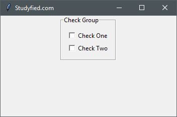
The following python script creates a one LabelFrame that contains two check buttons, No action is associated with check button, Here LabelFrame simply draws a border around all widget it holds that gives group look, And at the top title is displayed which is the name of this group.
from tkinter import *

# Top level window
window = Tk()

window.title("Studyfied.com")
window.geometry('350x200')

# Create label frame
checkGroup = LabelFrame(window, text = "Check Group", padx=10, pady=10)
checkGroup.pack()

# CheckButton 1
checkbutton1 = Checkbutton(checkGroup, text="Check One")
checkbutton1.pack()

# CheckButton 2
checkbutton2 = Checkbutton(checkGroup, text="Check Two")
checkbutton2.pack()

window.mainloop()
Output
The above code produces the following output in windows operating system.
Explanation
Following line creates a Tkinter window
from tkinter import *

window = Tk()

window.title("Studyfied.com")
window.geometry('350x200')
See explanation of Tkinter window – Tkinter top level window
This two lines creates LabelFrame, The first parameter of the LabelFrame is the name of the parent window or widget. Here it is “window”. The second parameter is text which is used to set some title for this group. Third and Fourth parameter is to add padding around the widget. You can leave it if you don’t need. And the second line checkGroup.pack() is geometry manager that packs widgets into rows or columns.
# Create label frame
checkGroup = LabelFrame(window, text = "Check Group", padx=10, pady=10)
checkGroup.pack()
This snippet creates two check buttons which are added to our checkGroup. Here checkGroup is passed as parent widget.
# CheckButton 1
checkbutton1 = Checkbutton(checkGroup, text="Check One")
checkbutton1.pack()

# CheckButton 2
checkbutton2 = Checkbutton(checkGroup, text="Check Two")
checkbutton2.pack()
See how to use CheckButton – Tkinter checkbutton widget
Some LabelFrame properties
| Property Name | Description |
|---|---|
| background / bg | Sets the background color for this widget. Default is applications background color. |
| borderwidth / bd | Border width for this widget. The default is system specific but usually 1 to 2 pixels. |
| cursor | The cursor to display when the mouse moves over the widget. By default, the standard cursor is used. |
| foreground / fg | Sets the color for label text. Default is system specified |
| font | Font to use for label text. Default is system specified. |
| height | Sets the frame height in pixels. Default value is empty that means it calculates itself. |
| padx | Horizontal padding to add around the child widgets. The default is 0 pixel. |
| pady | Vertical padding to add around the child widgets. The default is 0 pixel. |
| labelanchor | Sets the position of label text. Default is NW or UPPER LEFT CORNER. |
| labelwidget | Widget to use label text. If not specified text option is used. Default value is empty. |