What is Radiobutton?
The radio button is used to create a single choice option, where the user can select only one option from multiple options available. It is a standard Tkinter widget, A Radiobutton can contain text and image and you can also associate a python function or method with each button.
The Radiobutton widget is useful when you want to show multiple options to the user and from there user is allowed to choose only one option.
Example
The following python script shows a simple example of Radiobutton, Where two Radiobuttons are added in LabelFrame, and they share the same variable name. To make Radiobutton work properly you need to specify the same variable property value in all Radio buttons in the same group.
from tkinter import *
# Top level window
window = Tk()
window.title("Studyfied.com")
window.geometry('350x200')
# Create a label frame
radioGroup = LabelFrame(window, text = "Select Gender")
radioGroup.pack()
# Radio variable
gender = IntVar()
# Create two radio buttons
male = Radiobutton(radioGroup, text = "Male", variable = gender, value = 0)
male.pack(anchor=W)
female = Radiobutton(radioGroup, text = "Female", variable = gender, value = 1)
female.pack(anchor=W)
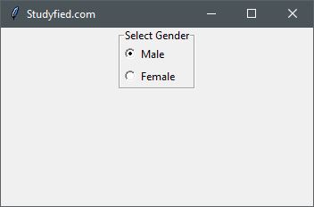
window.mainloop()Output
The above code produces the following output in windows operating system.
Explanation
Following line creates a Tkinter window
from tkinter import *

window = Tk()

window.title("Studyfied.com")
window.geometry('350x200')
See explanation of Tkinter window – Tkinter top level window
This two lines creates a label frame.
# Create a label frame
radioGroup = LabelFrame(window, text = "Select Gender")
radioGroup.pack()
See how to use LabelFrame – Tkinter labelframe widget
This snippet creates two radio buttons, The first parameter passed in Radiobutton is parent widget, Here it is radioGroup, the second parameter is a variable name, variable name should be same for all radio buttons in the same group so that only one can be selected at a time, here it is gender, and last parameter is value, it tells what should be the value of variable gender when a particular radio button is selected.
# Create two radio buttons
male = Radiobutton(radioGroup, text = "Male", variable = gender, value = 0)
male.pack(anchor=W)

female = Radiobutton(radioGroup, text = "Female", variable = gender, value = 1)
female.pack(anchor=W)
Some Radiobutton properties
| Property Name | Description |
|---|---|
| anchor | Controls the position of the text (or image) within the label. Valid values: N, NE, E, SE, S, SW, W, NW, or CENTER. The default is CENTER. |
| background / bg | Sets the background color for this widget. The default is system specific. |
| bitmap | Bitmap to be displayed on the widget. If the image option is specified, this option is ignored silently. |
| borderwidth / bd | Border width for this widget. The default is system specific but usually 1 to 2 pixels. |
| command | The function or method called when the button is pressed. A callback is a function, a bound method, or any other callable Python object. If you do not use this option, nothing happens when the user presses the button. |
| image | Image to display on the widget. The value must be PhotoImage, BitmapImage, or compatible object. If specified, this overrides text and bitmap options. |
| compound | Controls how text and images within a button are combined. By default, if an image or bitmap is given it will be drawn instead of text. When this option is set to CENTER, the text is drawn on the image. Valid values: BOTTOM, LEFT, RIGHT, or TOP |
| cursor | The cursor to display when the mouse moves over the widget. By default, the standard cursor is used. |
| foreground / fg | Sets the color for text or bitmap in button. The default is system specific. |
| font | Font to use for the button. Buttons can only contain single font text. The default is system specific. |
| height | The height of the button. If the text is displayed on the button, the size is indicated in text units. If an image is displayed on the button, the size is specified in pixels (or screen units). If you set the size to 0 or omit it, it is calculated based on the contents of the label. |
| padx | Horizontal padding to add inside the button. The default is 1 pixel. |
| pady | Vertical padding to add inside the button. The default is 1 pixel. |
i love your blog and always like new things coming up from it.