What is Spinbox widget?
Spinbox widget is similar to standard Tkinter Entry widget, It is also used to take input from the user, but here input is predefined or between some range. Like – if you want to take one number from the user between 1 to 100 then Spinbox can be used.
Example
The following Python script creates a window containing one Spinbox widget that takes one number from the user between 1 to 10. The user can increase or decrease the visible value on the entry field by clicking on up and down button.
You need to write following code in any text editor and then save it with .py extension. To execute the application, Type py SpinboxExample.py command in terminal.
from tkinter import *
# Top level window
window = Tk()
window.title("Studyfied.com")
window.geometry('350x200')
# Create a spinbox
spinbox = Spinbox(window, from_=1, to=10)
spinbox.pack()
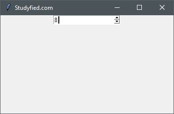
window.mainloop()Output
The above code produces the following output in windows operating system.
Explanation
Following line creates a Tkinter window
from tkinter import *

window = Tk()

window.title("Studyfied.com")
window.geometry('350x200')
See explanation of Tkinter window – Tkinter top level window
This snippet creates a Spinbox widget, the first parameter is the name of the parent widget or window. Here it is “window”. And the remaining two are min and max range number, the user can increase or decrease it by up / down arrow button, You can also pass a tuple with some values instead of range. You can also provide other properties to customize the widget.
# Create a spinbox
spinbox = Spinbox(window, from_=1, to=10)
spinbox.pack()
The second line spinbox.pack(), is geometry manager that packs widgets into rows or columns.
Some spinbox properties
| Property Name | Description |
|---|---|
| background / bg | Sets the background color of the widget, Default Is platform specific |
| borderwidth / bd | The width of the entry widgets border. The default is system specific but usually 1 to 2 pixels. |
| cursor | The cursor to display when the mouse moves over the widget. By default, the standard cursor is used. |
| buttoncursor | Cursor to display when the mouse moves over the up / down arrow button. |
| command | Command to the user for arrow buttons similar to Tkinter button. |
| increment | Defines how much value to increase or decrease when up / down pressed. |
| disabledforeground | The foreground color to use when the widget is disabled or invalid. The default is system specific. |
| exportselection | If true, the selected text is automatically exported to the clipboard. The default is true. |
| font | Font to use for the widget. The default is system specific. |
| foreground / fg | The foreground color for this widget. The default is system specific |
| justify | Align the text inside the entry field. Use one of LEFT, CENTER, or RIGHT. The default is LEFT. |
| textvariable | Associates the Tkinter variable (usually StringVar) with the contents of the entry widget. |
| padx | Horizontal padding to add around the text. The default is 1 pixel. |
| pady | Vertical padding to add around the text. The default is 1 pixel. |