What is Text widget?
The Text Widget used to display formatted text. It is one of the most powerful widgets available in Tkinter. It allows you to display and edit text with a variety of styles and attributes.
The Text widget is useful when you want to display text documents, either containing plain text or formatted text with different attributes like font, color, images, etc.. The Text widget can also be used as a text editor.
Example
The following python script creates a window containing one text widget, It is a simple text editor. You need to write following code in any text editor and then save it with .py extension. To execute the application, Type py TextWidgetExample.py command in terminal.
from tkinter import *

# Top level window
window = Tk()

window.title("Studyfied.com")
window.geometry('350x200')

# Create text editor
text = Text(window)
text.pack()

window.mainloop()
Output
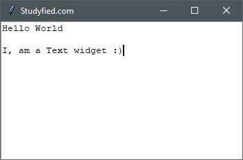
The above code produces the following output in windows operating system.
Explanation
Following line creates a Tkinter window
from tkinter import *

window = Tk()

window.title("Studyfied.com")
window.geometry('350x200')
See explanation of Tkinter window – Tkinter top level window
This snippet creates a text editor widget, The first parameter passed in Text is parent widget, Here it is the window, You can specify more attributes and options to customize the Text widget.
# Create text editor
text = Text(window)
text.pack()
Indexes
Indexes are work like a pointer that points some position of text inside the Text widget. Similar to python sequence indexes, text widget indexes correspond to positions between the actual characters.
Different index types –
- line / column (“line.column”)
- line end (“line.end”)
- INSERT
- CURRENT
- END
- User-Defined Marks
- User-Defined Tags (“tag.first”, “tag.last”)
- Selection (SEL_FIRST, SEL_LAST)
- Window Coordinate (“x, y”)
- Embedded Object Name (window, images)
- Expressions
Some Text Widget properties
| Property Name | Description |
|---|---|
| background / bg | Sets the background color for this widget. The default is system specific. |
| borderwidth / bd | Border width for this widget. The default is system specific but usually 1 to 2 pixels. |
| cursor | Cursor for this widget. By default, the xterm cursor is used. |
| foreground / fg | Sets the foreground color for this widget. The default is system specific. |
| font | Font to use for this widget. The default is system specific. |
| width | The width for this widget. By default, it takes the entire available space of its parent. |
| height | The height for this widget. By default, it takes the entire available space of its parent. |
| padx | Horizontal padding to add inside the widget. The default is 1 pixel. |
| pady | Vertical padding to add inside the widget. The default is 1 pixel. |
| selectbackground | Sets the selection color. The default is system specific. |
| wrap | Defines how to wrap the line. Default is CHAR |